Data Visualization with Matplotlib
Matplotlib is a foundational plotting library in Python that provides comprehensive tools for creating static, animated, and interactive visualizations. It is highly customizable and integrates seamlessly with NumPy for numerical data manipulation. The core functionality of Matplotlib lies in its pyplot module, typically imported as plt.
Basic Plotting
Plotting Lines: Create simple line plots with customizations.
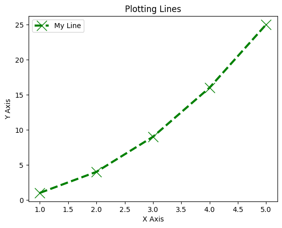 Line Plot
import matplotlib.pyplot as plt

# Data
x = [1, 2, 3, 4, 5]
y = [1, 4, 9, 16, 25]

# Line plot with customization
plt.plot(x, y, color='g', linestyle='--', linewidth=3, marker='x', markersize=15, label='My Line')

# Title and labels
plt.title("Plotting Lines")
plt.xlabel("X Axis")
plt.ylabel("Y Axis")

# Add legend
plt.legend()
plt.show()Trigonometric Functions
Sine and Cosine Waves: Plot trigonometric functions.
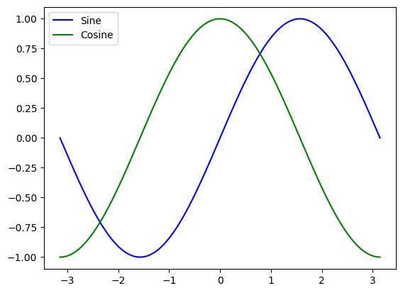 Sine and Cosine Waves
import numpy as np
import matplotlib.pyplot as plt

# Generate data
x = np.linspace(-np.pi, np.pi, 100)
y1 = np.sin(x)
y2 = np.cos(x)

# Plot
plt.plot(x, y1, label='Sine', color='blue')
plt.plot(x, y2, label='Cosine', color='green')

plt.title("Sine and Cosine")
plt.legend()
plt.show()Subplots
Multiple Plots in a Single Figure: Create subplots to visualize multiple datasets.
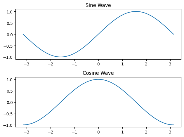 Subplots
plt.figure()

# First subplot
plt.subplot(2, 1, 1)
plt.plot(x, y1)
plt.title("Sine Wave")

# Second subplot
plt.subplot(2, 1, 2)
plt.plot(x, y2)
plt.title("Cosine Wave")

plt.tight_layout()
plt.show()Other Visualizations
Bar Charts: Represent data with rectangular bars.
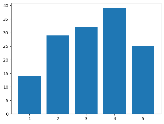 Bar Chart
x = np.arange(1, 6)
y = np.random.randint(1, 50, 5)

plt.bar(x, y, color='purple')
plt.title("Bar Chart")
plt.xlabel("X Axis")
plt.ylabel("Values")
plt.show()
Pie Charts: Visualize proportions in a dataset.
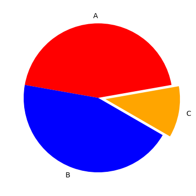 Pie Chart
x = [4, 4, 2]
colors = ['red', 'blue', 'orange']
labels = ['A', 'B', 'C']

plt.pie(x, colors=colors, labels=labels, explode=(0, 0, 0.1), startangle=90)
plt.title("Pie Chart")
plt.show()
Scatter Plots: Plot points to identify relationships between two variables.
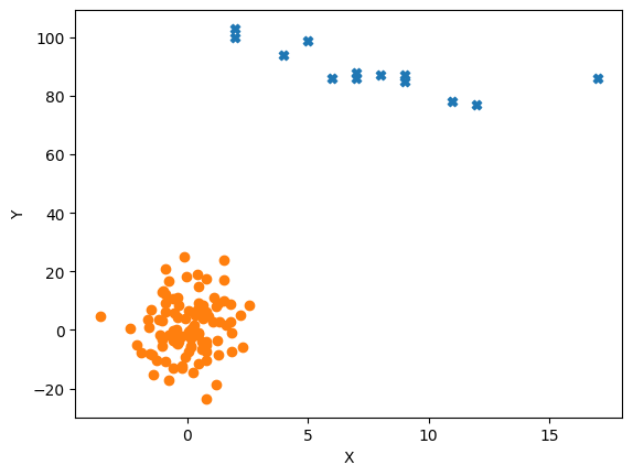 Scatter Plot
x = np.random.normal(0, 1, 100)
y = np.random.normal(1, 10, 100)

plt.scatter(x, y, color='green', marker='o')
plt.title("Scatter Plot")
plt.xlabel("X Axis")
plt.ylabel("Y Axis")
plt.show()Advanced
Support Vector Machine (SVM): Visualize the decision boundary and support vectors.
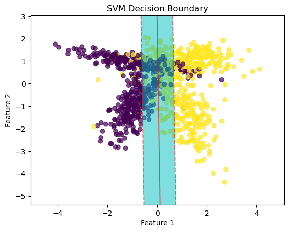 SVM Decision Boundary Visualization
import numpy as np
import matplotlib.pyplot as plt

# Select First 2 features as X and Y
X_vis = X[:, :2]

# Find min and max of both columns
x_min, x_max = X[:, 0].min() - 1, X[:, 0].max() + 1
y_min, y_max = X[:, 1].min() - 1, X[:, 1].max() + 1

# Construct a meshgrid - a list of coordinates
h = 0.01 # Step
x_coordinates, y_coordinates = np.arange(x_min, x_max, h), np.arange(y_min, y_max, h)
xx, yy = np.meshgrid(x_coordinates, y_coordinates)

# Decision boundary
x_1d, y_1d = xx.ravel(), yy.ravel() # Convert 2D to 1D
values_1d = np.c_[x_1d, y_1d] # Concatenate
Z = model.decision_function(values_1d)
Z = Z.reshape(xx.shape)

plt.scatter(X_vis[:, 0], X_vis[:, 1], c=y, cmap='viridis', alpha=0.7)
plt.contourf(xx, yy, Z, levels=[-1, 0, 1], colors='c', alpha=0.5)
plt.contour(xx, yy, Z, levels=[-1, 0, 1], colors='r', alpha=0.5, linestyles=['--', '-', '--'])
plt.xlabel('Feature 1')
plt.ylabel('Feature 2')
plt.title('SVM Decision Boundary')
plt.show()